Color Psychology: How Different Colors Are Influencing You
Psychologist Carl Jung considered color as a vital tool in psychotherapy. He noted that each color symbolizes a particular state or condition, much like gold is an emblem of sovereignty, spirituality and intuition.
There are documented cases of pharmaceuticals, too, that prepare placebo medications thru intentionally using colors to help get a desired effect – for instance using red pills as stimulants and blue pills for inducing sleep.
Glasgow Scotland, in 2000, also had began installing blue street lights, which reportedly resulted in a marked reduction in the area’s crime rate. Since then, other communities too have adopted this change.
What’s even more is that people make certain color associations when it comes to assessing the physical attractiveness of a person for a possible (romantic) relationship. This theory is according to psychologist Andrew J. Elliot.
But while women don’t generally become attracted to or respond to a potential male partner based solely on the color of his clothes, for instance, they do use color for themselves in order to attract a male counterpart, say for instance by using red as a sexy color symbol. Elliot’s study indeed reveals that men in social situations tend to be draw to a woman wearing red compared as compared to any other color.
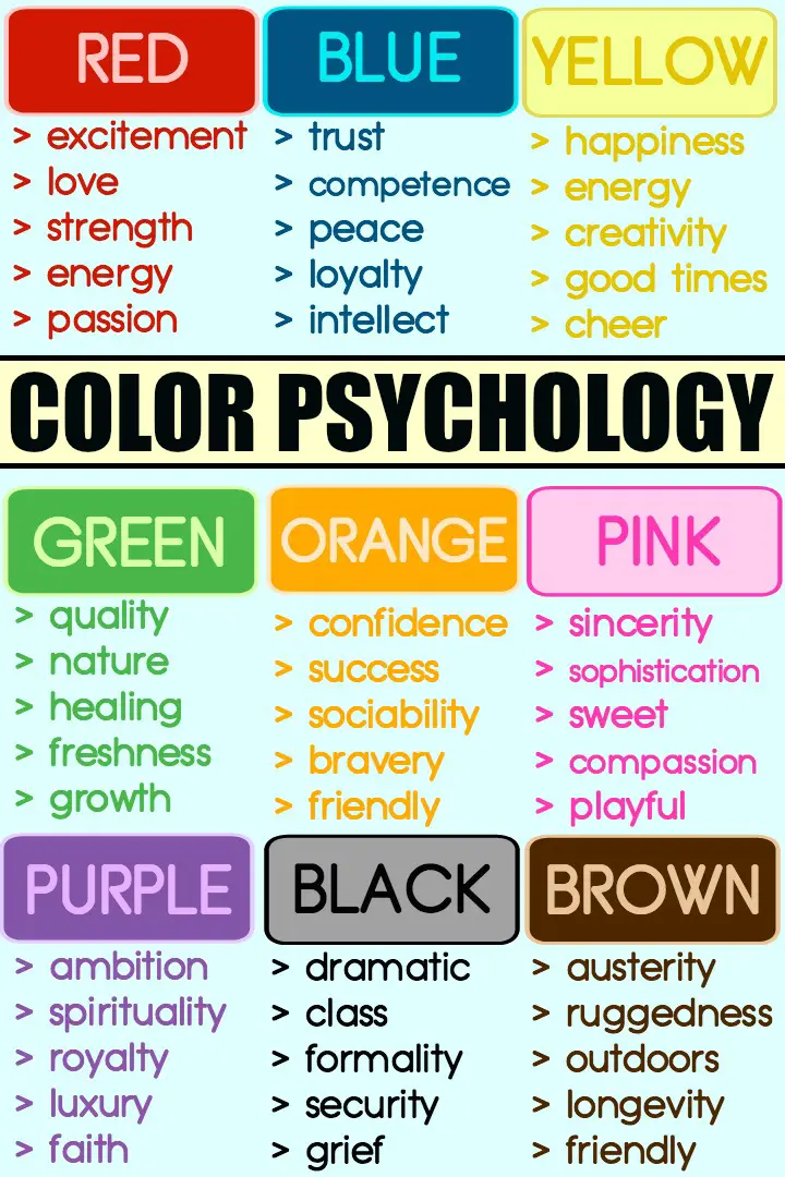
In the United States, people often attach certain basic meanings to each different color. Below is a list of different colors and their (US) commonly accepted psychological effects in people:
The Psychology of Color
 Red
Red
Red is a significant color reflecting excitement and love but can also signal negative issues such as anger, danger and lust. Red is also associated with passion, energy, strength and endurance.
Blue
Blue plays a significant role in influencing personal competence. It is a color symbolizing peace, security, trust, loyalty and intellect. Blue is also the color representing masculinity. Many corporate organizations use the color blue. The downside of blue is that it can be associated with depression, fear and coldness.
Yellow
Yellow is a color denoting cheer, light and energy. It is the therefore associated with happiness, creativity, joy and good times. The downside of yellow is that it can represent jealously and instability.
Green
Green influences is often a useful indicator of good quality or taste. It is also strongly associated with nature, healing, freshness and growth. It can sometimes indicate money. On the downside, green is related to envy and guilt.
Orange
When it comes to color psychology orange is related to confidence, success, sociability and bravery. It is a friendly and all-around good color but can sometimes be associated with being outdated.
Pink
Considered a girly color, you might be surprised to know that pink reflects sincerity and sophistication. It is also the color of sweetness, playfulness and compassion. On the downside, pink can indicate immaturity or weakness.
Purple
Purple is associated with ambition and drive, spirituality, royalty, devotion and luxury items. It can also indicate moodiness, fantasy and mystery.
Black
Black can give a dramatic emphasis. It is also associated with formality, security and class. On the downside, black is also associated with grief and fear.
Brown
Brown is the only color viewed to be symbolic of austerity or ruggedness. It is an earthy color associated with the outdoors. It also symbolizes longevity and friendliness.
White
White reflects purity and sincerity. It is also perceived to be a color of pure bliss or happiness. Other characteristics include innocence, cleanliness, freshness and also distance and coldness.
Colors’ Use in Corporations or Businesses
If you were going to buy a tennis racket for your dad on Father’s Day, wouldn’t you be more drawn to a sporting goods store with a green/red/ brown logo than one with a pink logo? Both brown or pink stores sell tennis rackets that would functionally have the same performance on the court, but of course, the ruggedness expressed by the color brown of the other shop fits more with your Father’s Day gift project . If you were buying the tennis racket for your mom instead, then buying from a store with a pink logo wouldn’t be such a problem. This is how the power of colors in brands or businesses work.
Of course, there are exceptions to this general rule.
Corporations and businesses often use the science of color in their logo’s design, packaging, as well as store design plan. They may combine two or more colors and use either high or low contrast colors depending on their particular target audience. A shopper may be attracted to a logo or store and respond well to its business or products as it appeals particularly to his/her perceptions of function and/or quality.
Product labeling also uses carefully chosen color changes in order to make products stand out or make them more eye-catching. Brands may create changes in the colors of their packaging if current trends in buyer’s preferences have also changed, however favorite brands such as a famous generic brand of shampoos and conditioners may retain their products’ packaging look.
For example, if they have been know to always have, say, a shiny green label, they may keep that color or alter it to closely resemble the original look of the label so that to shoppers may still have the confidence that it’s still the same product they’ve been using or buying. Switching to a trendier color scheme could only be effective if the brand has also established a certain major change in its product or image.
Books About Color Psychology
In terms of marketing and advertising, companies also take great care in using color names that sound more exotic or attractive for a line of product. For instance, instead of a brilliant red lipstick being sold as “Bright Red,” it can use other enticing names like “Cherry Dazzle” so that shoppers will be more excited about the selection based on the name’s suggested color.
People also tend to be drawn to the colors of the business’s store itself. Warm colors, especially at the store’s entrance and display windows help attract shoppers to enter the store as well as encourage impulse buying. Cool colors help provide confidence to shoppers or buyers so they can make a purchase, most especially for items requiring serious thought or deliberation.
Meanwhile, food establishments that use red as their accent color often have customers that don’t linger on their store for too long, thus color red is most ideal for fast food chains or other businesses that need a design that helps empty their tables quickly so new customers can come in. The stimulating effect of the color red generally gives people a sense of restlessness or an urge to get moving.
Factors Influencing the Effect of Colors
The effect of color on certain individuals is based on many different factors aside from gender, natural preferences set by DNA, history, culture and, environment. A color’s influence to our perceptions may even depend on our mood or how fatigued or energized we feel at a particular time.
One good example is when a person feels cold physical. He/she may easily find comfort in a room with warm colors in the same way a person experiencing some form of heat may find delight in a room that has predominantly cool colors.
Then there is also the fact that color meanings or associations vary with each unique individual. Color associations is evidently a science that is rather impossible to explain completely.
Studies on color preferences are fairly uncertain mainly because of the many influences that may affect each person’s current perception, however it is noteworthy enough that certain colors, more or less, produce certain effects leading to more predictable results.
